The Urgent Request Wasn’t the Red One
“That one is urgent.”
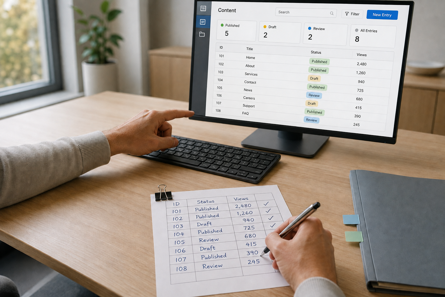
In one of our first workshops with the client, while mapping how their current process worked, they pointed at a request that wasn’t marked red.
Another case had the urgent status, but it was waiting for a document from the customer. The one they were pointing at needed an internal approval. Until someone acted, the process couldn’t move forward.
Two requests. Two different colors. And a distinction their team understood better than the software did.
Their current tool could tell people what status a request had. What it didn’t always make clear was what someone needed to do about it.
The team had learned to work around it. They opened cases to check the details, asked colleagues for context, and remembered which combinations of statuses actually meant act now.
Those workarounds told us something important about the problem we needed to solve.
Their Status Colors Didn’t Say What to Do Next
The client was replacing that workflow with a new customer service platform. We were designing it.
The new platform needed to help internal teams review requests, manage documents, and move cases through different stages without constantly checking individual records.
Their current workflow relied heavily on status colors. The colors weren’t wrong. They were doing too much work.
They were being used to communicate three different things: the current status, the priority, and the next action. Only the first was explicit.
That was the distinction we needed to address.
We worked with the client to understand what each state meant operationally. What actually made a request urgent? When was the team waiting on a customer? Which cases could move forward immediately, and which needed someone internally to take action?
That’s the part that doesn’t show up in a screenshot. Adding another indicator would have been easy. The harder work was understanding what each state meant in the operation and designing around the next action.
Once those rules were clear, we made the interface much more direct.
Instead of expecting users to interpret five colors, the dashboard communicated what was happening:
Waiting for customer document.
Requires internal approval.
Ready to proceed.
Each request also made its next available action clear.
We kept color as a useful visual cue, but it no longer carried the whole message.
In the first walkthrough, the team could spot which cases needed action — and which were waiting on a customer — without opening them.
The dashboard wasn’t just organizing information. It was removing a step people had been performing in their heads.
Good UX Shouldn’t Make People Guess
There’s an accessibility benefit to that decision, too.
In its 2026 Million report, WebAIM found automatically detectable accessibility failures on 95.9% of the one million home pages it analyzed.
It’s a striking figure. And many of the problems WebAIM identifies involve ordinary interface decisions, not complicated technology.
In the dashboard we designed, clear status descriptions meant people didn’t need to distinguish colors to understand a request. Consistent information hierarchy made cases easier to scan. We also designed keyboard navigation and focus behavior to follow the same logical order as the visual interface.
None of that was a separate accessibility feature. It was part of designing the components properly.
The result was simple: someone could recognize what needed attention without opening every row or remembering what a particular color meant.
That’s useful for someone navigating with a keyboard. It’s useful for someone who has difficulty distinguishing colors. And it’s useful for an employee trying to get through a busy afternoon.
Different circumstances. The same clear experience.
The original workshop gave us the question that guided the dashboard:
Can someone tell what needs to happen next without distinguishing colors or opening every request?
It’s a useful question for almost any operational interface.
Because when people have to memorize workarounds just to understand what a screen is telling them, another indicator probably isn’t the answer.
Sometimes the best design decision is to stop making people guess.
If you’re planning a digital product that needs to make complex work feel simpler, let’s talk about what you’re building.